Brew Cloud App provides a platform for home brewers of all experience levels to log, track, and share their creations. BrewCloud follows the Beer Judge Certification Program and has almost all the content that the users need, but utilizing and finding this content is difficult. In addition to having a difficult to navigate user flow, there are a few aspects that need to be elaborated on. Over the course of three days I addressed some of the main user issues.
Self-guided 3 day project.
Specification: Design research, UX/UI
Execution: Sketch, interviews, Illustrator, Photoshop, After Effects
Pain Point: BrewCloud follows the Beer Judge Certification Program and has almost all the content that the users need, but utilizing and finding this content is difficult. In addition to having a difficult to navigate user flow, there are a few aspects that need to be elaborated on.
Things in bold are key points
Day 1
Problem Defining, Interview, Concept Development, Analysis
Day 2
Concept Refinement, Interview, User flow, Wireframe, Identity development, Insights
Day 3
UX Construct, UI Design, Mockup
Analysis: What needed to be addressed
Some tools need to be included in the app. Explanations, flavor profiles, and possible comparable beers should be included. Also, a more user-friendly path to the social platform of the app needs to exist.
From exploring the app these were the main pain points:
Tools:
Tools:
- There are multiple methods of calculating alcohol content (for example brix and gravity). There should be an in-app method of converting between these units so it is not necessary to leave the app.
- Ingredients added should define beer style.
- Profiles for experience level should be made.
- Ability to use clones(recipes for store-bought beers) as base recipes
- Beginners should be able to pick from clones to make and learn from existing recipes. This interface should be very simplified, mainly a search bar that can search from types of beers or specific beers, returning a list to pick from.
- Mid-Level and Expert should have full access to inputs (similar to current interface information and inputs)
Social Platform
Descriptions and Information
- Doesn’t easily share to social platform (have to contact support about sharing)
Descriptions and Information
- There’s no way to understand what yeast is similar to other brands
- Yeast, hops, and malt types would really benefit from a written taste profile
- Suggested brewing recipes
Exploring the App: key takeaways
Analysis of takeaways:
These points helped define the core questions for interviews. Which then helped define user personas and their pain points.
- Should not have to leave the app.
- Users have different skill levels.
- Pre-built recipes should exist.
- Sharing should be easy.
- Ingredients should have descriptions.
Analysis of takeaways:
These points helped define the core questions for interviews. Which then helped define user personas and their pain points.
At this point of the day I pivoted from user flow and pain points to interviews.
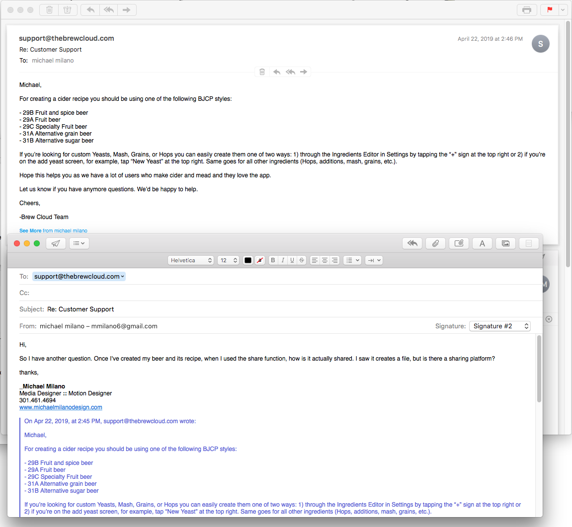
On day one and two of this project I conducted three types of interviews. First, I contacted Brew Cloud support to make sure that issues I was having, were in reality actually user issues (see emails). The second place I conducted interviews was asking the question (below) on the Facebook brewing groups Home Brew Network and Homebrewing 101. Lastly, I conducted two in person interviews. The first was with my local home-brew shop (Monrovia Home Brew) and the second was with the brewmaster of a local brewery (Pacific Plate Brewing).
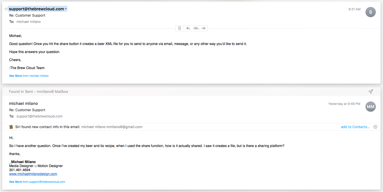
An early email between me and Brew Cloud. (Left top) Before deciding to do this project Brew Cloud contacted me on Twitter about trying their app on my next brewing project. During the project I reached out with questions about the sharing function. (Left bottom and right)
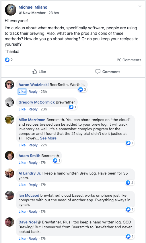
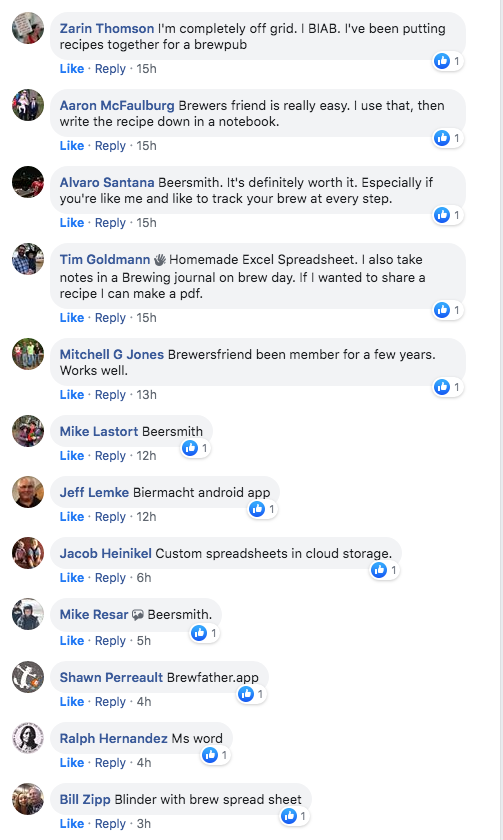
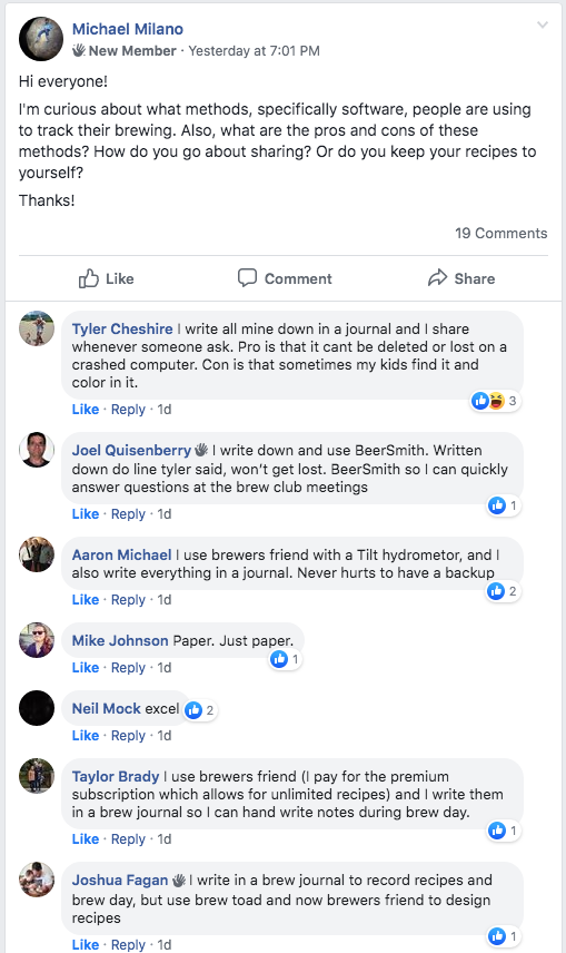
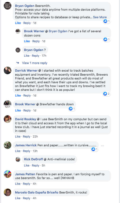
Facebook Brewing Groups:
Q: Hi everyone!
I’m curious about what methods, specifically software, people are using to track their brewing. Also, what are the pros and cons of these methods? How do you go about sharing? Or do you keep your recipes to yourself?
Thanks!
Mike: BeerSmith. You can share recipes on “the cloud” and recipes brewed can be added to your brew log. It will track inventory as well. It’s a somewhat complex program for the computer and I have found that the 21 day trail didn’t do it justice at all…
Taylor: I use brewers friend (I pay for the premium subscription which allows for unlimited recipes ) and write them in a brew journal so I can handwrite notes on brew day.
Ian: brew father! cloud based. works on phone just like the computer with out the need of another app. Everything always in synch.
From these interviews it was clear that experienced brewers, if they used a software (a lot of users still only use pen and paper), would still lean toward the professional brewing program BeerSmith, the web platform Brewers Friend, or the existing app Brew Father. The main reasons they used Brew Father or Brewers Friend was because both platforms offered cloud storage and the ability to share.
Interviews: Facebook key takeaways
Analysis of takeaways:
Brew Cloud should focus on new to mid-level brewers. The App would benefit from having a cloud platform.
- Expert brewers use professional software.
- Some might also use websites to share.
- Most experts are not open to a new app.
Analysis of takeaways:
Brew Cloud should focus on new to mid-level brewers. The App would benefit from having a cloud platform.
Home Brew Network

HOMEBREWING_101
While people were responding to my post, I started to conduct the in-person interviews. The first person I was able to talk to was Megan from Monrovia Homebrew Shop. To the right is the audio from the interview and below are some of the key take-aways from her expertise as someone that helps new and experienced brewers.
Megan (works at Monrovia Homebrew):
•••••••••••
… it (tracking your recipe) is honestly the most important thing to keep your recipe… We had two new brewers come in last week. And they made an asian pear light blonde ale, and they didn’t really keep track of what they were doing. And (when we asked them) what did you do and how did you do it? [they responded] I don’t know and I don’t remember…Homebrewing when you just get into it is mostly trial and error. Because if you are trying to brew a beer that tastes like xyz beer, you have to keep track of it so you can replicate it…
…I think that a person that’s really getting into home-brewing is trying to emulate something that they like. When you are getting into beer it’s because you like drinking beer, it’s what happens after you brew something. People will find a beer they like and try to make it. Their inspiration piece…
… I don’t think people are aware of specific flavor profiles of beers unless they have studied it or they’re farther down their home brewing journey…
… the ones (experienced brewers) that care about their flavor profiles are the ones that nerd out about their hop selection, nerd out about their yeast selection, because they are like, “oh well I could just choose any style for a New England IPA, but I could choose any yeast, but this is the Burlington yeast and it has this characteristic (special/unique flavor profile)…
…app not worth using, if there are features that I have to search for, I don’t want to do that. If the menu is organized in a certain way that makes it easier I’ll use it… when people create apps, they have to think about it being accessible to the newer home brewer. It has to look very basic, and the other features are there underneath it…
…you can put grain in your mouth and can kinda get an idea what is going to be (know what it tastes like), you smell hops or you can put hops in your mouth, maybe not a whole pellet, (and know what it’s going to taste like or smell like)… but you’re not going to open a yeast packet and put it in your mouth It can tell you it’s for hefs and it’s going to taste like cloves, but what does that mean… I think that if you don’t know the yeast you are getting you are not going to get the style you want, that’s for sure…
•••••••••••
Inteviews: key takeaways from Megan
Analysis of takeaways: Brew Cloud has three user personas beginner, mid-level, and expert brewers. Although mid-level brewers might make changes to recipes, both mid-level and beginners would bennifit from working form existing recipes with flavor profiles for ingredients.
- Make tracking recipe easy.
- Have recipes available.
- Educate users on flavor profiles.
- Have flavor profiles of ingredients.
- Three skill levels of brewers.
- Mid-level brewers will want to make small changes.
- Experts want full control.
Analysis of takeaways: Brew Cloud has three user personas beginner, mid-level, and expert brewers. Although mid-level brewers might make changes to recipes, both mid-level and beginners would bennifit from working form existing recipes with flavor profiles for ingredients.
Megan
After talking to Megan many of the initial pain points were confirmed. Most importantly the interview highlighted the need for a skill level screen and then need to have prebuilt in recipes. By the time I finished the interview some facebook comments had been made. One of the biggest takeaways from this was that experienced brewers are pretty set in their ways, and are using mainly pen and paper, Brewers Friend, or BeerSmith. This further pointed out that the main user base for the app would most likely be people that like beer and wanted to give brewing a try or people that have brewed before and might want to try to alter a cloned beer recipe.
With these insights, I adapted the questions I had for the master brewer of Pacific Plate who I would talk to on day two. I wanted to hear what a master brewer thinks a new brewer would want and need to know to start out. I wanted to know what software they use and why. How hard it would be for a beginner to operate that software. Whether they would be willing to change software platforms. Lastly, something that was briefly touched upon from the first day's interviews, was whether or not the brewery shared their recipes and how they did so.
Steven (brewmaster):
••••••••••
...It kinda streamlined it (BeerSmith 3, newest version, allows for much more customization while automatically calculating for specifics. ex. you can specify temp of hop additions which change the specific IBUs a unit of bitterness)...
…when I started I took a recipe and adjusted it basically to my liking, and see what it did (how it changed from the beer you were cloning/copying)…
…I would highly recommend brewers friend (for beginners) it’s free online and you just plug and chug… coming from BeerSmith, it’s super easy, you literally add in the fermentable and then you add in the grain and it does the calculations… it’s still very much a beginner’s thing, it doesn’t go into detail about your equipment. That’s the nice thing about BeerSmith is you can put in your equipment and all the variables for it, because that’s when you really start honing your recipes… when you’re home-brewing and you want to do it with a friend, you have to go learn their system…
…this is the flavor I want to obtain, what style is going to compliment that best, and then we go from there…
…and that’s why the recipes are on the wall (referring to recipes at home-brew shop and how new brewers approach home-brewing) and usually beginners pull them off the wall and say yea I’m going to make a brown or I’m going to make an IPA, and they usually start to play with the hops, but they are still within that style, then they might throw some spices at it or some fruit… when they start getting more serious about home-brewing they are gonna go straight for the style guidelines…
…what I really liked about BeerSmith is you could upload everything to the cloud. If my laptop goes down everything is saved for me…
•••••••••••
Interviews: key takeaways from Steven:
Analysis of takeaways:
Brew Cloud should be focusing on the new and mid-level brewing communities. There should be existing base recipes for beginners and mid-level brewers, and they should be editable. Experts, however, should have full control to build their recipes. Lastly, there should be a cloud platform for sharing.
- Expert brewers use BeerSmith (agrees with Facebook).
- He started by tweaking recipes to see what would happen.
- Experts want a flavor profile and will choose a beer style that compliments it.
- Wants cloud support for sharing and data safety.
- Brew Cloud should easier to use than existing programs.
Analysis of takeaways:
Brew Cloud should be focusing on the new and mid-level brewing communities. There should be existing base recipes for beginners and mid-level brewers, and they should be editable. Experts, however, should have full control to build their recipes. Lastly, there should be a cloud platform for sharing.
Steven

Analysis of Interviews:
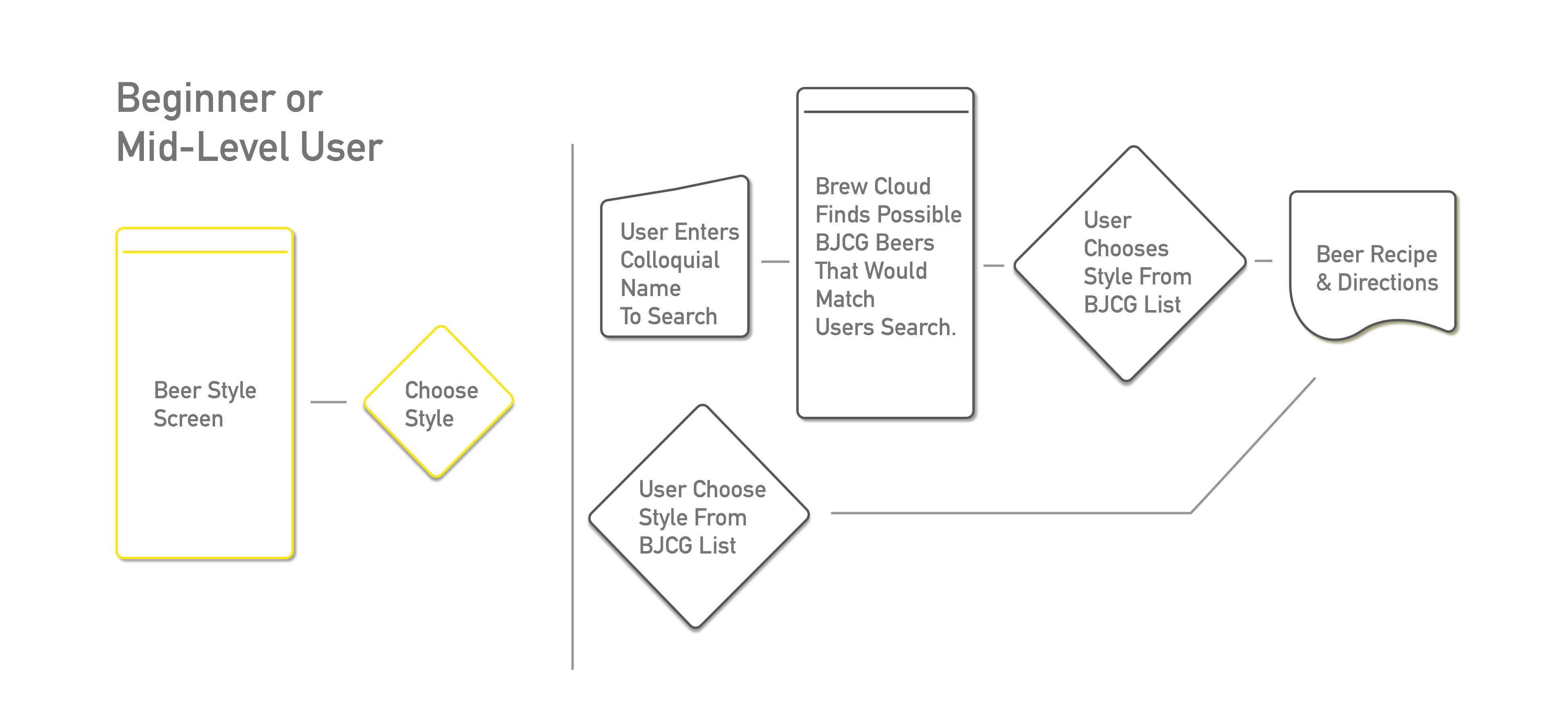
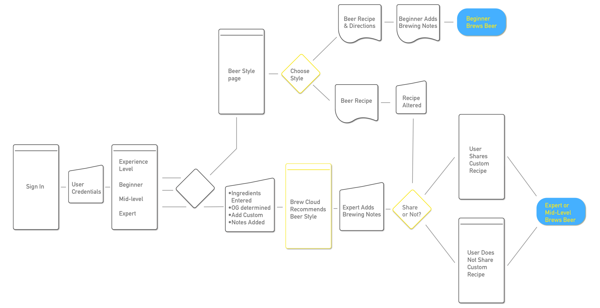
From these interviews, it was clear that the Brew Cloud should really be catering to brewers that were just starting out (User Personas defined to the right). To do this it should provide basic recipe direction of different beer types, while using its interface to start to make associations of the different characteristics of different beers. Most brewers that were experienced would likely not try using something new, but if they did it would have to have cloud storage to back up their recipes, and it would have to have a better platform to share their recipes. This identified three sub user flows that are a part of the main user flow. By introducing a starting screen after login, a user can decided how experienced they are and how much control they want over the app. Beginner and mid-level users would benefit from having to choose from a list of beers, and be able to make small changes from the base recipe. Experts, on the other hand, could start entering ingredients that they are using, which would then define what style it would be. Lastly the user flow of sharing needs to be further developed. One way would to share would be by giving the users the option to email a friend the recipe, which is already a tool the app has included to contact support. Another option would be to upload the recipe to Brewers Friend’s website. Lastly, and best for the app, would be to develop a Brew Cloud Community cloud storage space.
From the interviews and further analysis, the main user flow was created, as well as the three sub-flows that address the main pain points. Below is the main user flow. To the right are the three sub-flows.
User personas and user flows from the analysis:
Interviews point out the need for three user personas.
User Personas
1. Beginner → Wants to try to brew a beer/cider
2. Mid-level → Has brewed a few times, knows what they want to some
degre
3. Expert → Flavor chaser knows exactly what flavors+style they are
trying to craft
From those personas, there are three sub-flows
- Beginners and mid-level brewers
- Expert brewers
- Sharing platform
Click Images to enlarge
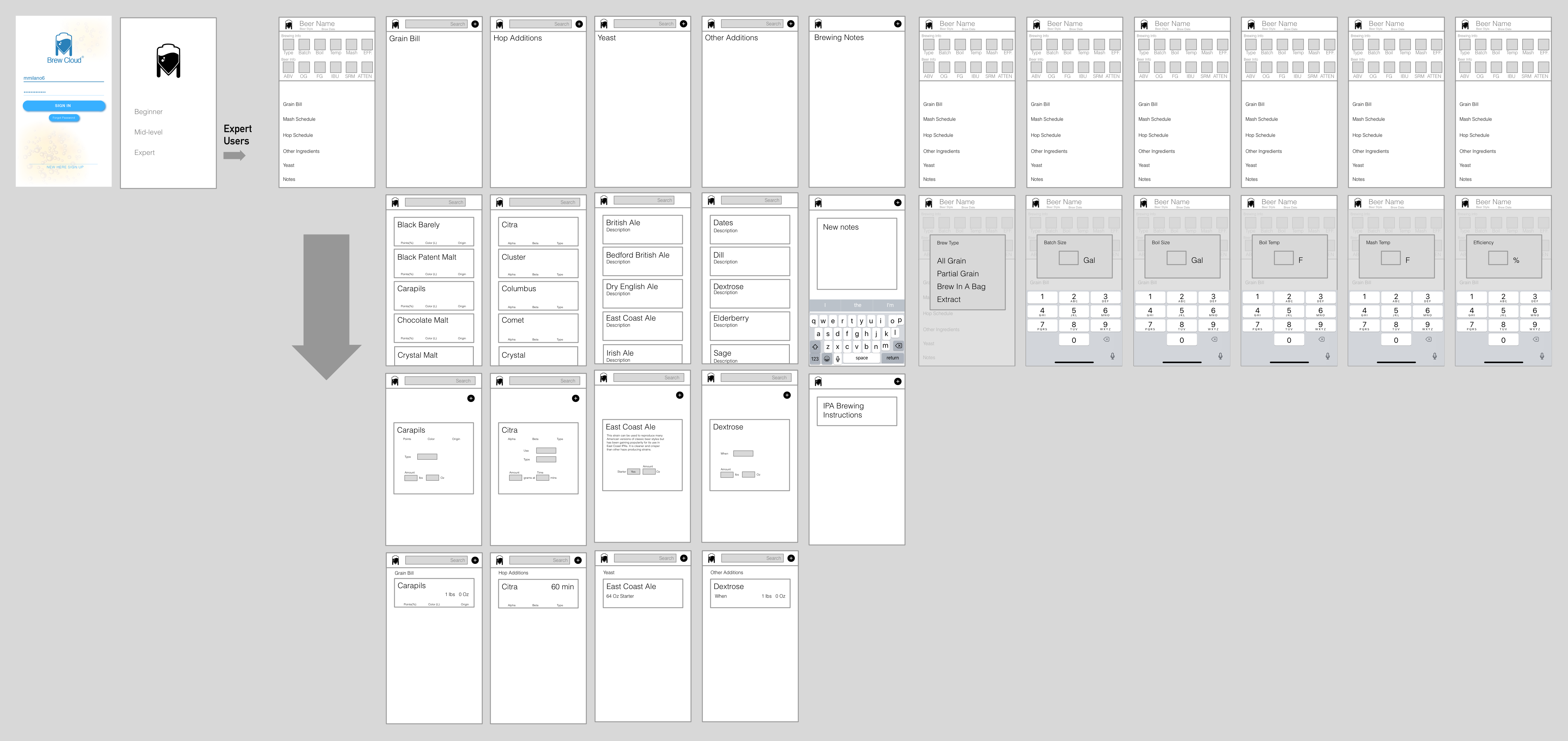
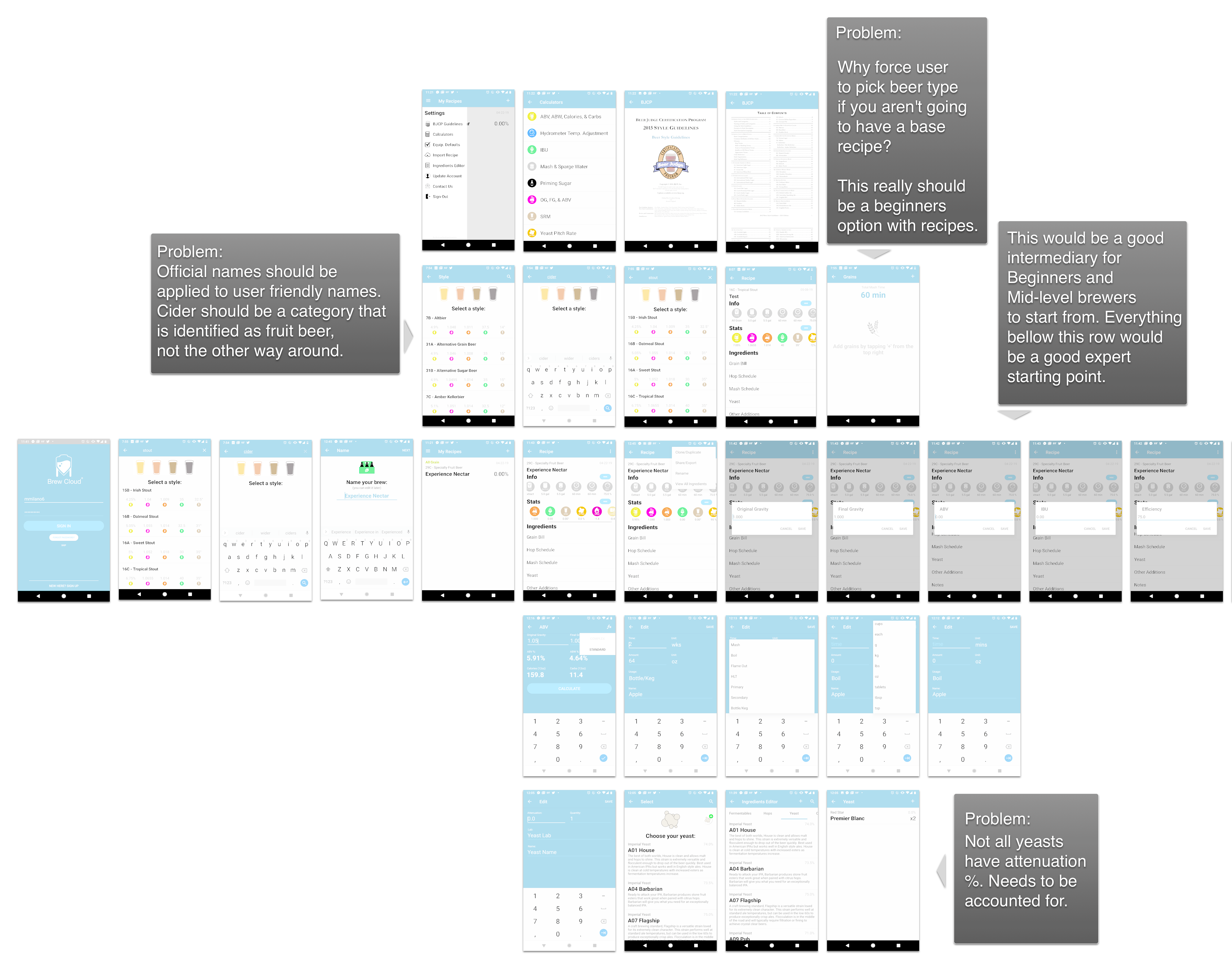
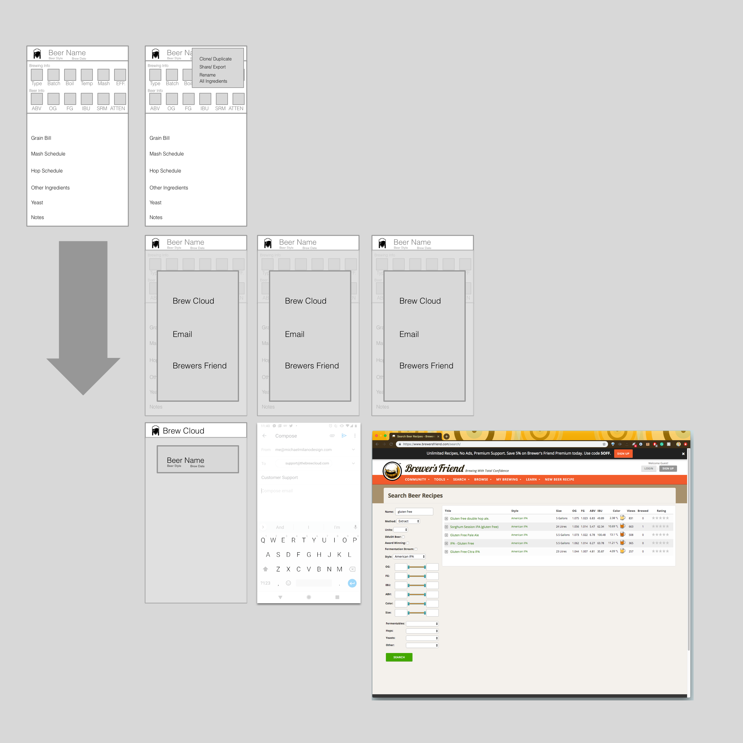
After establishing the user flow I began the wireframing and exploring the branding. Wireframing was very much the main focus at this point, but I felt distinguishing some form of color code for the beer styles was necessary to reinforce learning beer styles for new users. Below are the wireframes. To the right is the original app user flow. Below that is the wireframing of the sharing options.
Click Images to enlarge
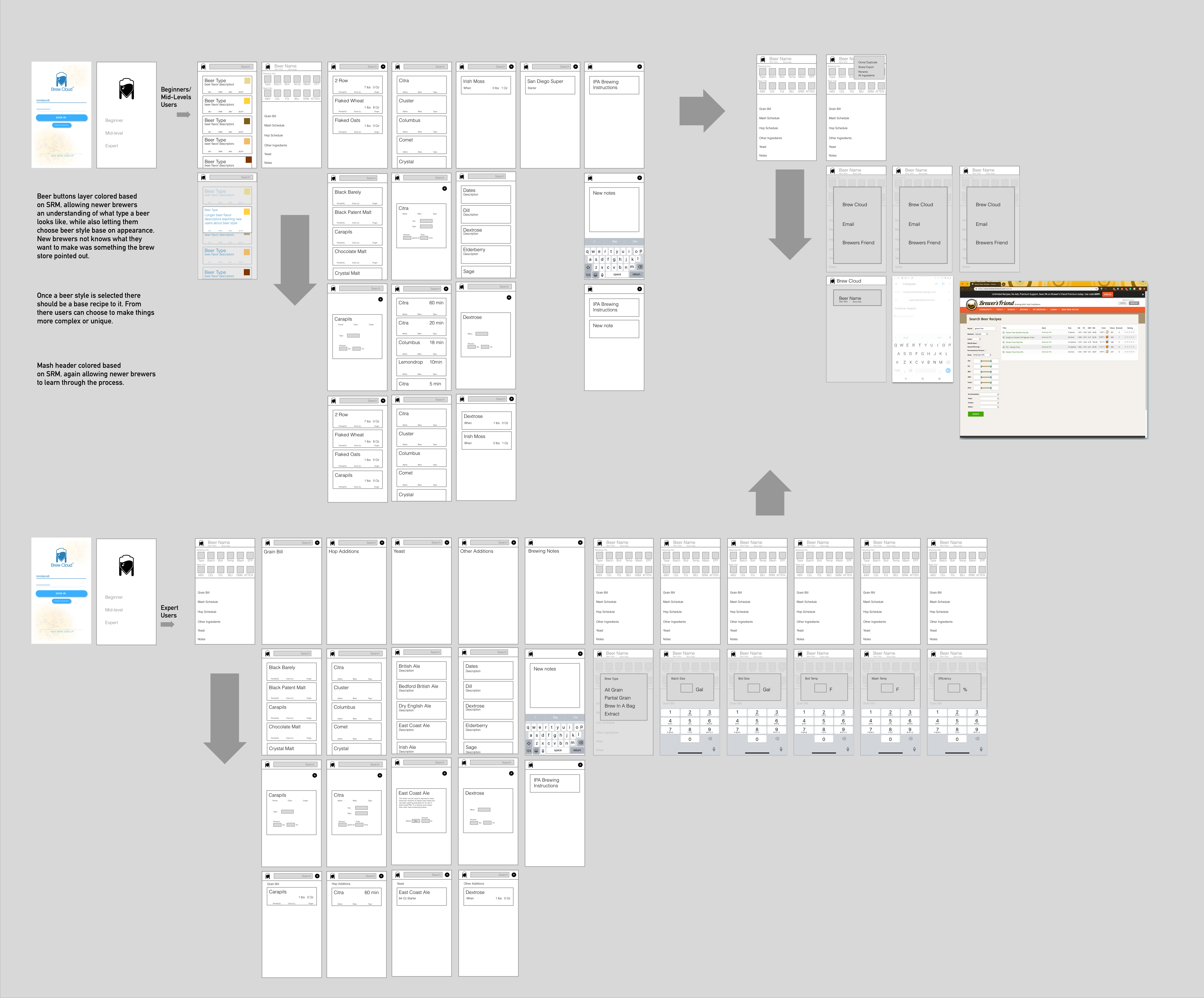
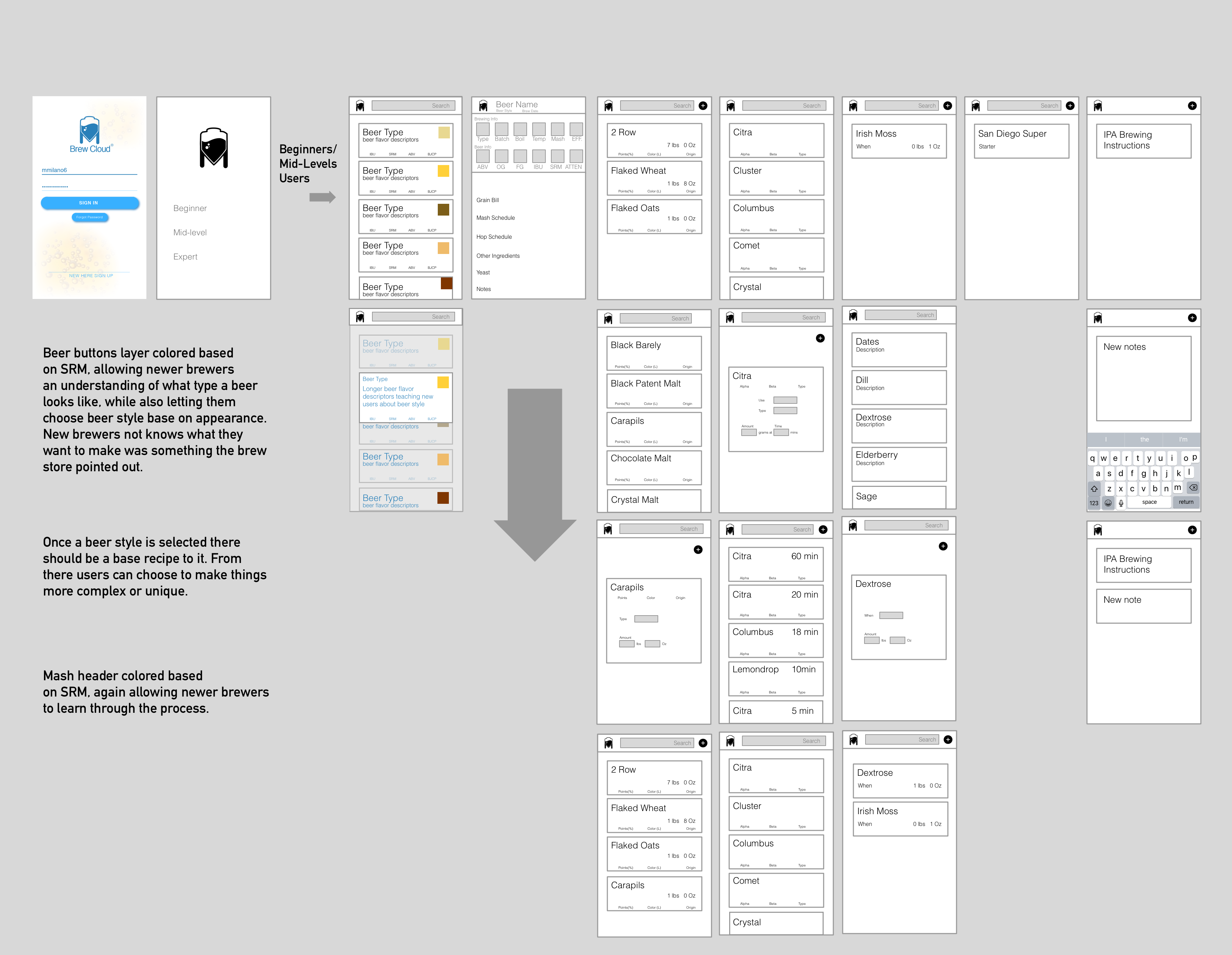
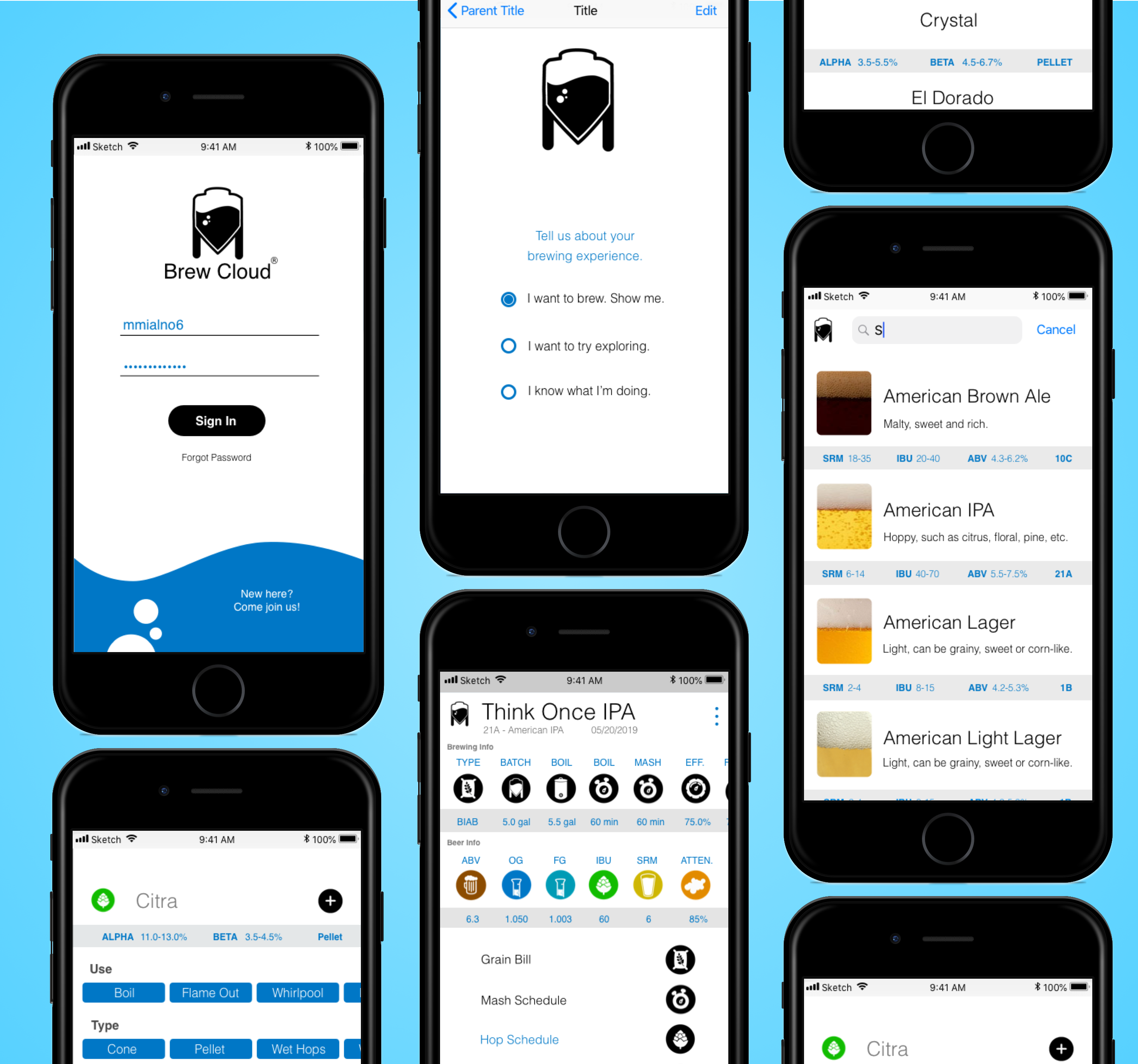
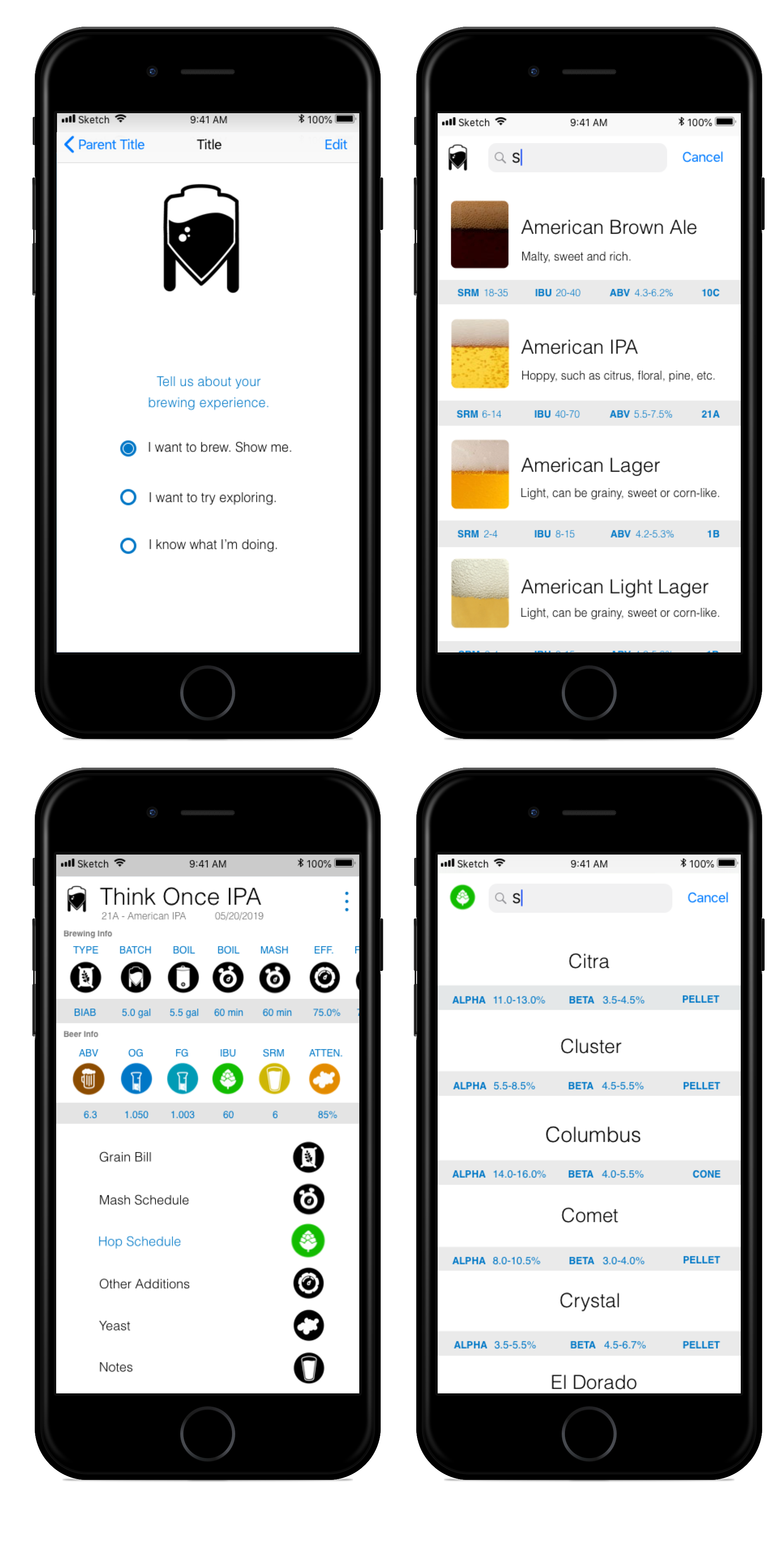
For beginners and mid-level brewers, the process starts in a way that teaches them about beer styles based on appearances. This foundation to their brewing is something most of them can relate to because, as mentioned in the interviews, they want to brew because they like drinking good beer. This evolved in the UI design by including close-up images of beer and its head for each beer style. This further showcases a visual representation of the characteristics of the beer style from the brewing judge certification program. After the user chooses a beer style, by look or title, they are then brought to the main brew dash which has the base ingredients and steps ready for them to start the brewing process. This is also where a more experienced brewer can start to add hops, grains, or other ingredients.
Starting from the other side of the spectrum the expert user adds ingredients with little input from the app. Once they add all ingredients the app makes a suggestion of what the style could be. From the interviews, it was clear that most expert users are not so focused on making a specific style or clone of beer like new brewers, but more importantly, are searching for a specific flavor profile.
The third, and possibly most important, addition is the sharing platform. Based on all the interviews it was very clear that brewers like having a platform that makes it easy to share their work. This would mean that Brew Cloud should make a cloud space for users to share their creations. If that's not an option they should add an extra step to the current sharing protocol. Rather than just downloading a file to the user's phone they should create that file and then have it attached to an email. This is a function that has already been built for contacting support, and it should be implemented in the sharing function. The last sharing form, also based on interviews, is Brewer’s Friend. This cloud platform already exists and is widely used. One thing that did stand out from the interviews was that brewers tend to write things down and then manually enter the brewing details later. Using Brew Cloud could cut out a lot of that work and gain a bigger user base from that feature.
Wireframing and early identity development: key takeaways
- The user decides skill-level.
- For beginners and mid-level users, they search beer styles in a way that teaches the styles based on appearance and SRM.
- After choosing a beer style they are provided a base recipe and are ready to brew.
- The expert adds ingredients and the app recommends a beer style based off input.
- The users should be able to share through the app’s cloud, email, or Brewer’s Friend.
Click Images to enlarge
The last day mainly focused on developing the UI. While doing this I wanted to keep the Brew Cloud identity but also wanted to give it a bit more pop and sophistication. I started by making a quick mood board based on the aesthetics I found while researching. A lot of brewing equipment, especially the systems professionals use, are like laboratory grade brewing vessels. Many are made from polished metals or large glass vessels. I wanted this laboratory-like pristineness to show through in the design. Another design tool I wanted to implement was the use of color codes or SRM colors. The last big thing that I wanted to be a focus on was the purity and crispness of the ingredients and the beer. To the right is the mood board.

Click Images to enlarge
Mood Board: key takeaways
App should capture the look and feel of:
App should capture the look and feel of:
- Laboratory cleanliness and sophistication
- Fresh ingredients
- Rich flavors
- Crisp beer
- SRM understanding
After quickly making the mood board I began working on the UI. I simplified the color palate while utilizing black and white to both distinguish the Brew Cloud identity and highlight that laboratory crisp cleanness. Additionally, I wanted to keep the blue of the original identity but chose to make it more deep and dark, giving it a higher contrast and to feel more modern.
Another big design decision was to add an image of the beer alongside its beer style for new brewers, which replaced the initial idea of having SRM colors. Details from the image like beer color, clarity, head color, head density, and carbonation are all defining characteristics of each beer style that no longer have to be looked up and read in the brewing judge certification program section. More importantly, these are details that the user learns about, can relate, and compare their beers too.
The brew dash was redesigned to have more of a step-by-step feel. Originally the section for the brewing process had the last icon slipping off the screen and the brewing steps out of order. This made the steps of the brewing process feel like random categories. By listing the steps in the right order and having them all on the screen at once, it makes it clear to new brewers is a series of steps, like a checklist for brew day.
The hop selection screen was simplified by removing the descriptions of each hop and clearly showing the alpha, beta, and hop form. This was done because new brewers are less likely to tweak the recipe that they chose. Mid-level brewers are more likely to want to add a hop that they have already tasted in another beer to see how it will change an existing clone or recipe. Experts will more than likely be building their recipes from scratch, and have a knowledge base of what that hop tastes and smells like. Additionally, having hop description for the new brewers and mid-level brewers seemed less necessary because they are more likely to make their decisions based off the beer description they read or because they are trying to replicate a clone.
UI: key takeaways
• Implement mood board styles and ideas• Use images of beer instead of SRM color
• Implement flavor descriptions
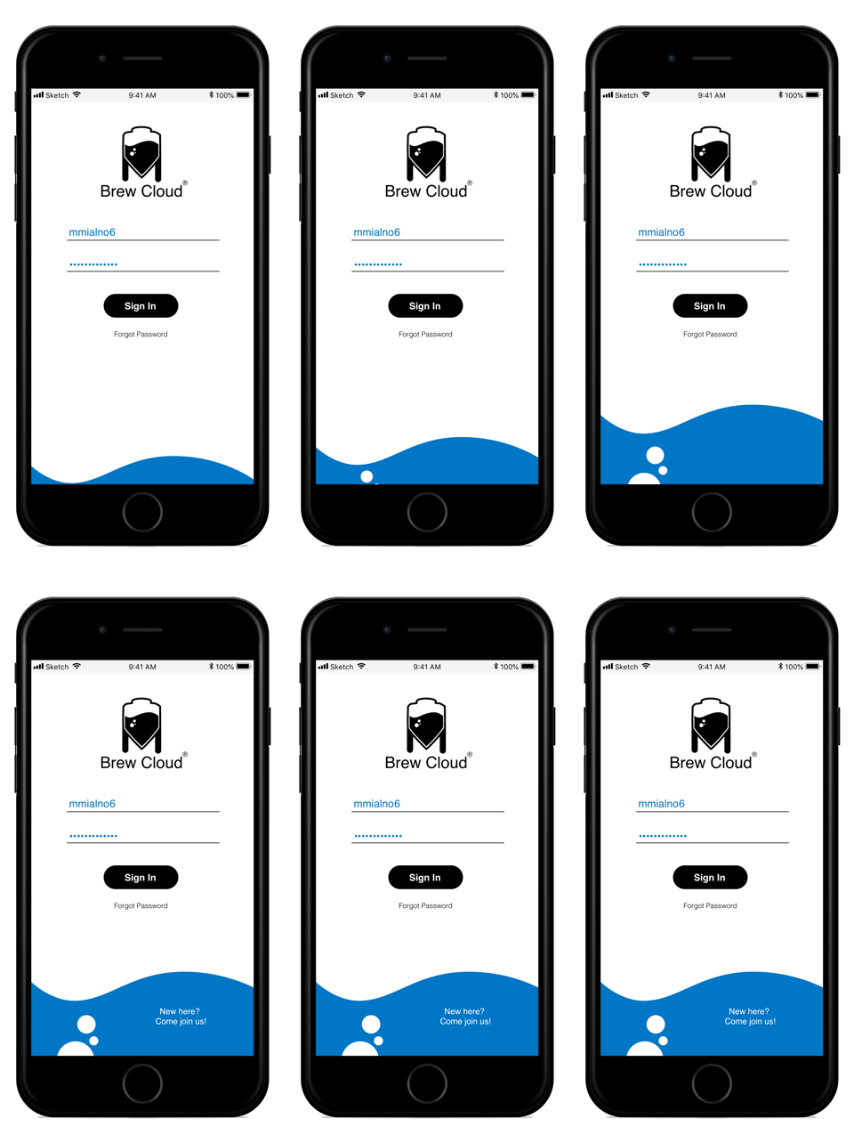
Below is the initial log in screen, which leads to the experience level screen, and then the user-flow continues from left to right.
Click Images to enlarge

All works © Michael Milano 2010-2019. Please do not reproduce without the expressed written consent of Michael Milano.
